Configuring Tours in OHIF with Shepherd.js
In OHIF, you can configure guided tours for users by leveraging Shepherd.js, a JavaScript library for building feature tours. This page explains how you can define and customize these tours within your app configuration file.
Overview
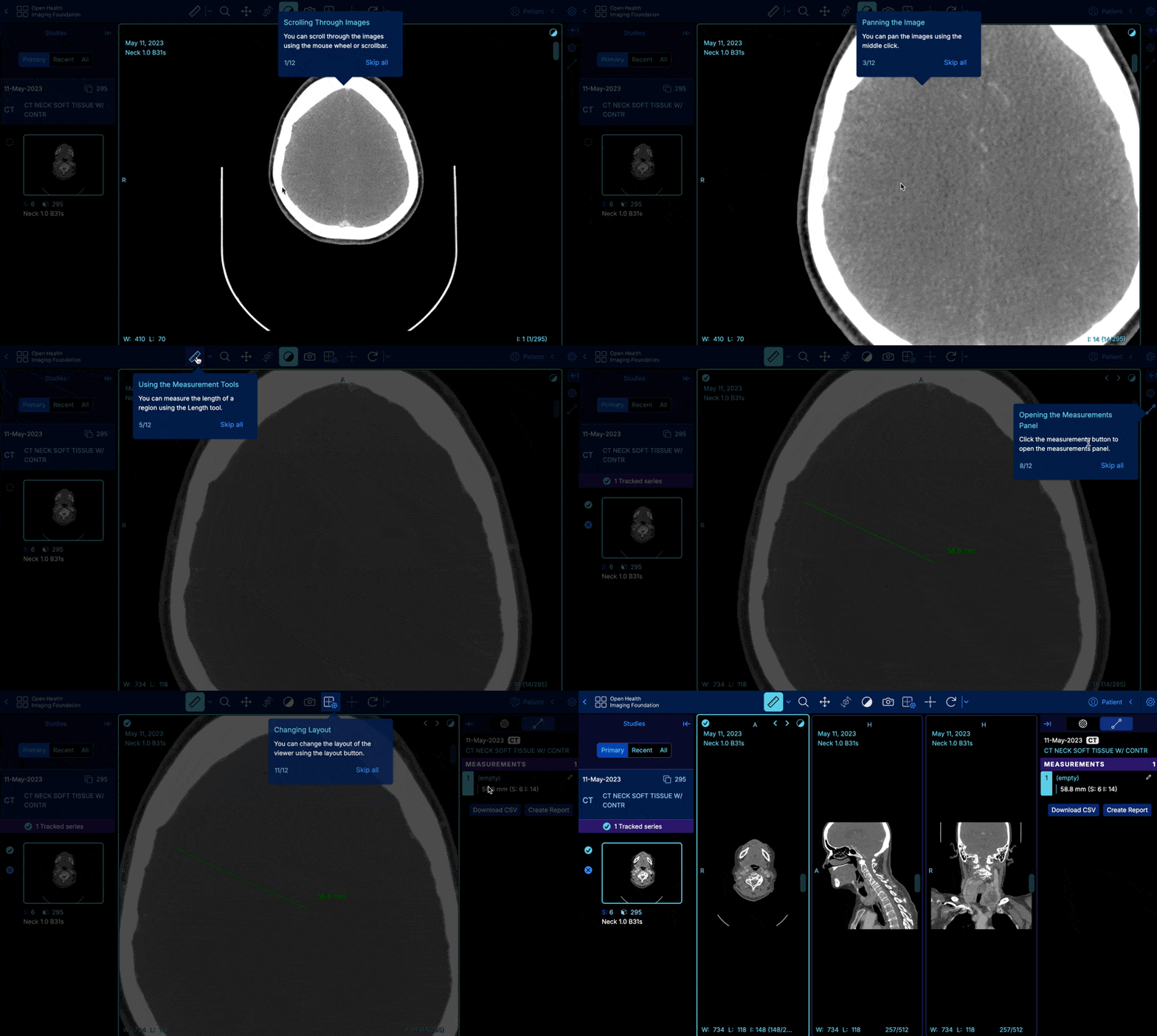
Tours allow you to provide step-by-step guidance to users, explaining different features of your mode/extension or the viewer. Each tour is associated with a route and consists of several steps, each guiding the user through specific interactions in the viewer.
Adding a Tour to your Configuration
Here’s an example of adding a tour to your configuration file:
window.config = {
  tours: [
    {
      id: 'basicViewerTour',
      route: '/viewer',
      steps: [
        {
          id: 'scroll',
          title: 'Scrolling Through Images',
          text: 'You can scroll through the images using the mouse wheel or scrollbar.',
          attachTo: {
            element: '.viewport-element',
            on: 'top',
          },
          advanceOn: {
            selector: '.cornerstone-viewport-element',
            event: 'CORNERSTONE_TOOLS_MOUSE_WHEEL',
          },
        },
        {
          id: 'zoom',
          title: 'Zooming In and Out',
          text: 'You can zoom the images using the right click.',
          attachTo: {
            element: '.viewport-element',
            on: 'left',
          },
          advanceOn: {
            selector: '.cornerstone-viewport-element',
            event: 'CORNERSTONE_TOOLS_MOUSE_UP',
          },
        },
        // Add more steps as needed
      ],
      tourOptions: {
        useModalOverlay: true,
        defaultStepOptions: {
          buttons: [
            {
              text: 'Skip all',
              action() {
                this.complete();
              },
              secondary: true,
            },
          ],
        },
      },
    },
  ],
};
Explanation of Parameters
tours Array
Each item in the tours array defines a specific tour for a particular route. The object contains the following properties:
id: A unique identifier for the tour. This helps in tracking whether the tour has been shown.route: The route in the application where the tour is applicable. When the user navigates to this route, the tour can automatically trigger if it hasn't been shown before.steps: An array of steps that define the individual guide elements in the tour. Each step corresponds to a UI element and guides the user through interactions.tourOptions: An object that allows you to configure the overall behavior of the tour, such as using a modal overlay or defining default step options.
steps Array
Each step defines a part of the tour. Here's a breakdown of the properties you can define:
id: A unique identifier for the step within the tour.title: The title of the step, which appears at the top of the tooltip for the step.text: The content or description of the step, explaining what the user needs to do or understand.attachTo: Specifies where the step should be attached in the DOM. It includes:element: A string selector or a DOM element that the step should attach to.on: Specifies the position of the tooltip relative to the element (e.g., 'top', 'left', 'bottom', 'right').
advanceOn: Defines an event that will automatically advance the tour to the next step. This is useful for actions like clicking a button or scrolling.selector: The CSS selector for the element that triggers the advance.event: The event name that advances the step, this can be a OHIF service event, or a cornerstone event, or any native JS event (e.g., 'click', 'CORNERSTONE_TOOLS_MOUSE_WHEEL').
beforeShowPromise: A function that returns a promise. When the promise resolves, the rest of the show logic for the step will execute. You can use this to ensure that the target element is ready before the step shows.
tourOptions
The tourOptions object allows you to configure the overall behavior of the tour. Here's a breakdown of the available properties:
useModalOverlay: A boolean that, if set totrue, places the tour steps above a darkened modal overlay. The overlay creates an opening around the target element so it can remain interactive.defaultStepOptions: Default options that apply to all steps in the tour. You can override these in individual steps. The following are some options available:buttons: An array of button objects that appear in the footer of each step. Each button can trigger actions like advancing the tour or skipping it. For example:text: The label text on the button.action: A function to execute when the button is clicked. You can advance the tour usingthis.next(), or complete it usingthis.complete().secondary: A boolean that, when set totrue, styles the button as secondary (often for actions like skipping).
floatingUIOptions
You can define positioning options for the steps using Floating UI middleware. This helps control how the steps are positioned, especially near the browser edges.
For example, you can ensure that the steps maintain a margin of 24px from the viewport edges by configuring preventOverflow middleware:
floatingUIOptions: {
  middleware: [
    preventOverflow({ padding: 24 }),
    flip(), // Allows the step to flip if it is overflowing
  ]
}
Shepherd.js Lifecycle Events
Each step and tour can have lifecycle events like show, hide, complete, or cancel. These events allow you to hook into the tour’s lifecycle to perform actions when certain events are triggered.
For example:
when: {
  show() {
    console.log('Step shown!');
  },
  hide() {
    console.log('Step hidden.');
  }
}
Customizing Your Tour
Once you have a basic tour in place, you can extend it with more advanced features like custom scrolling behavior, dynamic elements, and event-based step advancement. For more details, check out the Shepherd.js documentation.
Licensing
All versions below 14.0 for Shepherd.JS is under the MIT license, if you wish to use any version above 14.0, you can visit the ShepherdJS website to learn about their pricing and plans Shepherd.js
Demo

Conclusion
By leveraging Shepherd.js, you can provide users with interactive and informative guided tours of the viewer. This can greatly improve the user experience and help users understand how to use key features.